Black and white feels modern when one of the two clearly leads. Keep roughly two thirds light, put the dark on one wall, the vanity or the fittings, choose veining over flat colour, and light the dark surfaces on purpose. An even half-and-half split, with a chequered floor, is what dates the look.
In this guide 14 sections
- Black and white bathroom ideas at a glance
- What makes a black and white bathroom feel modern rather than dated?
- How much black should a black and white bathroom have?
- Should the marble effect be white, black or both?
- Matt or polished: which finish suits black and white?
- Which accent works with black and white: brass, bronze or chrome?
- Should the grout match the tile or contrast with it?
- Can you use a checkerboard floor without it looking dated?
- How do you light a black and white bathroom?
- How a DDL designer approaches a monochrome bathroom
- What is the maintenance reality of black bathroom surfaces?
- Black and white bathroom schemes compared
- What affects the cost of a premium monochrome bathroom?
- The bottom line
Black and white is a classic bathroom scheme, which is exactly why it needs a reason to be in your house. Done on autopilot, it reads as a template: a pure white suite, a chessboard floor and chrome everywhere. Done with intent, it is one of the most flattering palettes you can choose, because contrast is what makes a room feel drawn rather than assembled.
This guide is about the choices that separate the two. If you are still deciding on a colour at all, our green bathroom ideas cover the opposite approach, and our bathroom and tile trends guide shows where monochrome sits among other current directions.
Black and white bathroom ideas at a glance
- Let one tone lead. As a design rule of thumb, two thirds light with a dark feature tends to look calmer than an even split.
- Put the dark where it is seen once: a back wall, a vanity, a niche, or the fittings.
- Choose marble-effect veining over flat black and flat white. The vein does the work that a pattern used to do.
- Add one warm accent, such as brass or bronze, so the scheme is not cold.
- Decide the grout before the tile: tone-on-tone for calm, contrast for graphic.
- Use a chequerboard as a small, deliberate moment, not a whole floor.
- Light every dark surface, or it will read as a hole in the room.
- Accept that black shows water marks, and plan the cleaning routine before you buy.
What makes a black and white bathroom feel modern rather than dated?
Restraint and texture. A modern monochrome room has a clear lead colour, natural-looking veining instead of flat blocks, one warm or metallic accent and good lighting. A dated one splits the room evenly into black and white, repeats the same crisp contrast on every surface and relies on chrome and gloss.
The shift is mostly about softness at the edges. Pure black beside pure white is harsh. Slightly warmer whites, a black with grey or bronze in it and stone veining that blurs the line between them make the same palette feel considered rather than graphic.
How much black should a black and white bathroom have?
As a starting point, aim for about two thirds light and one third dark, or the reverse if you want a dramatic room. That ratio is design judgement, not a standard or a measured result. A true half-and-half split fights itself, because the eye has nowhere to rest. Put the weight in one place and let the other tone support it.
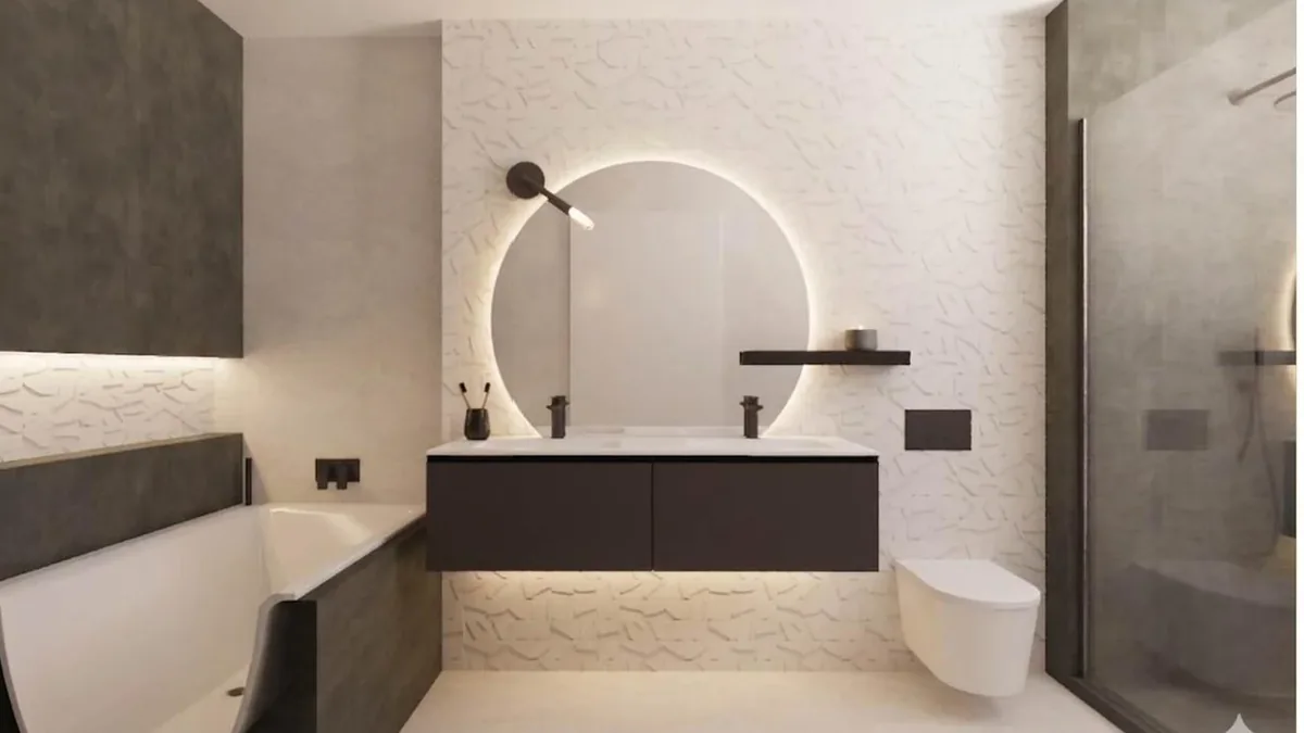
Where the dark goes matters as much as how much there is. Dark low and light high, with a charcoal floor and pale walls, feels grounded. A single dark wall behind the vanity or the bath works in most rooms, because it gives the eye a focal point and keeps the rest of the space bright. If daylight is poor, keep the large planes light and use black for a vanity front or a niche.
Should the marble effect be white, black or both?
Both, in the same room, but in different amounts. Use a white marble look with soft grey veining for the large surfaces, and a dark stone look with fine white or warm veining for the feature. The veining is the link: when the vein colours relate, two different tiles look like one family.
This is where large-format porcelain earns its premium. A big slab-like tile shows a long run of vein without many joints, so a wall looks like a single piece of stone. Our guide to book-matched tiles explains how a mirrored pair creates a symmetrical vein.
For a dark feature with real drama, look at onyx-effect porcelain. DDL's onyx-effect look book shows two black directions among its twelve boards, and our guide to onyx tiles in bathrooms covers what the material does well and where it needs care. The marble-effect look book is the place to compare white, grey and darker veining side by side. If you are weighing porcelain against real stone, porcelain versus natural marble sets out the trade-offs, and the complete guide to marble-effect porcelain covers formats and finishes. For whether the material suits a wet bathroom at all, start with are marble-effect porcelain tiles good for bathrooms.
Matt or polished: which finish suits black and white?
Matt on the floor and polished or glossy on the walls is the safest combination, and it often looks best. Dark gloss gives depth and reflects light. Dark matt looks soft and expensive, but it needs more light to show its colour. Black is the colour that exaggerates finish: polished black behaves like a mirror and shows every fingerprint, while matt black absorbs light and looks deeper and calmer.
The floor has a practical rule. Bathroom floors get wet, and polished surfaces are usually the more slippery option when they do. Our guide to matt versus polished tiles covers this in detail. Whatever you choose, ask for the tile's wet slip result. HSE guidance classes a pendulum test value (PTV) of 36 or more as low slip potential, and says barefoot areas should be assessed with Slider 55 rubber, so ask which slider a quoted figure used before you compare tiles.
Which accent works with black and white: brass, bronze or chrome?
A warm metal usually works best. Brass, bronze or copper-toned fittings stop a monochrome room feeling cold, and they pick up the warm veining that many marble looks carry. Chrome and brushed steel suit a crisper, more architectural scheme. Use one metal across the room, and repeat it at least three times.
Black fittings are popular, and they go wrong in only one way: quantity. Black taps, a black shower head, a black radiator and black hinges all in one room can feel heavy. A better rule is to let the fittings be black where the walls are light, and metal where the walls are dark, so the fittings always read against their background.
Should the grout match the tile or contrast with it?
Match it if you want the surface to read as one calm plane, and contrast it if you want to show the layout. Tone-on-tone grout suits large marble-effect tiles. Contrast grout turns a tile into a graphic pattern, which suits small formats, mosaics and a chequered floor.
On large tiles with narrow joints, matching the grout to the dominant tone makes the joint almost disappear. This is the quiet, expensive look. A bright white joint between dark tiles, or a black joint between white ones, makes the grid the main event. That can be a great decision, but it needs to be a conscious one, because it makes any unevenness in the setting very visible. Our guide on whether porcelain tiles need sealing is a useful companion.
Can you use a checkerboard floor without it looking dated?
Yes, if it is a small, deliberate moment and not the default. A chequered floor in one compact room, a cloakroom or the entrance to the bathroom, feels intentional. Across a large bathroom floor it competes with everything else. Choose a larger square, a muted pair of tones and plain walls.
The versions that feel current share three things: the squares are large, the tones are softened, such as warm white against charcoal, and the walls stay quiet. Veined tiles rather than flat black and white give the checkerboard a softer, stone-like quality. Our tile layout patterns guide sets out how each pattern behaves in a bathroom, and how to choose one that suits the room rather than the mood board.
How do you light a black and white bathroom?
Light dark surfaces on purpose, with more than one source. Dark tile absorbs light, so a single ceiling fitting leaves it flat. Add a lit mirror, a warm LED strip in a niche or under the vanity, and a wall wash where the dark stone is. The aim is light that grazes the vein.
Choose warm white light for most of the room, because cool light makes black and white feel stark. We cover positioning, layers and protection ratings in our bathroom lighting ideas guide; for any fitting in a wet area, your electrician confirms what each zone requires.
Glass deserves a thought too. Beside white marble-effect walls, standard clear glass can show a slight green tint, most visible at the edge. Low-iron glass is made to reduce that tint, so it is worth asking about for a shower screen.
How a DDL designer approaches a monochrome bathroom
This section is reasoning, built from DDL's published Aldenham design project and from general design practice. The Aldenham portfolio describes five bathrooms, and two of them sit at opposite ends of this palette. The page describes the guest bathroom as clean white stone with black accents, and the cloakroom as small-space drama using dark stone, brass warmth and controlled lighting.

Read the two together and the logic is clear. The guest bathroom keeps the surfaces pale and puts the black in small, exact places. The cloakroom, being small and used briefly, commits to dark stone and uses warm metal and light to stop it feeling closed in. Neither room splits the palette evenly. Each picks a lead, and each treats the supporting tone as an accent.

In general terms, a designer begins with the light, not the tile. Where does daylight arrive, which wall is seen first from the door, and how much dark can the room carry? Only then do tile, grout, fittings and lighting get chosen together, so the contrast is balanced across the whole scheme and not decided one item at a time. DDL designs and specifies the scheme; your own installer fits it from the written specification.
What is the maintenance reality of black bathroom surfaces?
Dark surfaces show water marks, limescale and soap residue more readily than mid-tones, and most in hard-water areas. That does not rule black out. It means choosing finishes you are willing to wipe, keeping a squeegee or cloth nearby, and avoiding glossy black where you do not want to clean.
White hides limescale well but shows dirt in grout and around the base of taps. Black does the reverse. A fine matt or honed black tends to hide fingerprints better than a polished one, and veined or speckled black tends to hide marks better than a flat solid colour, because the pattern breaks up the film of residue. This is general experience, not test data. Finishes on fittings differ and some do not tolerate abrasive cleaners, so follow the manufacturer's care instructions. See any dark tile in daylight and under artificial light before you decide.
Black and white bathroom schemes compared
| Scheme | Mostly light, dark accent | Mostly dark, light accent | Even black and white split |
|---|---|---|---|
| Feel | Bright, calm, current | Dramatic, enclosed, luxurious | Graphic, harder to live with |
| Best for | Most family bathrooms and en-suites | Cloakrooms and well-lit larger rooms | A statement floor in a small room |
| Where the dark goes | Vanity, niche, fittings, one wall | Walls and floor, with lit accents | Floor against walls |
| Marks and cleaning | Dark accents need a quick wipe | Water marks and limescale show more | Both tones show their own marks |
| Lighting need | Moderate | High: several layers | Moderate to high |
| Risk of dating | Low | Low if veined and well lit | Higher |
What affects the cost of a premium monochrome bathroom?
The main cost drivers are the tile itself, the format, the cutting and setting it demands, and the design time. We are not quoting figures here because they vary with the room. What changes the price most is the scale of the feature and the care taken over the veining.
- Large-format and book-matched tiles can need more careful cutting and setting than small standard formats.
- Onyx-effect and highly figured surfaces are often used as a feature on one wall rather than throughout, so the scale of the feature shapes the order.
- Feature lighting, such as a lit mirror, niche or backlit panel, adds electrical work as well as the fittings.
- Made-to-measure glass, a bespoke vanity and warm-metal or black fittings sit in addition to the tile.
DDL's bathroom design fee is £400 + VAT per bathroom, deducted from your subsequent order when that order exceeds £5,000 + VAT. It is worth having in a monochrome scheme, because the cost of getting contrast wrong is the cost of tile you have already bought.
The bottom line
A black and white bathroom feels modern when it is not an even split. Choose one tone to lead, keep the dark to one wall, the vanity or the fittings, and pick marble-effect or onyx-effect veining so the two tones blur at the edges. Use matt on the floor, gloss on the wall, one warm accent and plenty of layered light. Decide the grout colour early, keep any chequerboard small, and be honest about wiping black surfaces. Aldenham shows both ends of the range: a pale guest bathroom with black accents, and a dark cloakroom lit by warm metal.
The easiest way to judge contrast is to see the tiles side by side at full size, so start with a private showroom appointment at our Watford studio (no obligation, and by appointment only). If you want the tile, grout, fittings and lighting drawn up as one scheme, our bathroom design service is £400 + VAT per bathroom, deducted from your subsequent order when that order exceeds £5,000 + VAT. Design usually takes around 2 to 4 weeks, depending on project complexity. You can also browse the Aldenham design project and compare it with large-format porcelain tiles.
Sources
- HSE GEIS2: Assessing the slip resistance of flooring, which classes a pendulum test value (PTV) of 36 and above as low slip potential and recommends Slider 55 rubber for barefoot areas.
- Pilkington Optiwhite, a low-iron float glass described as giving reduced green tint compared with standard clear float glass.
- DDL Tiles Bathroom Design, Appointments and onyx-effect look book pages, for the fee, appointment and look book wording.
- DDL Aldenham Home design project, for the guest bathroom and cloakroom descriptions.